What do you do?
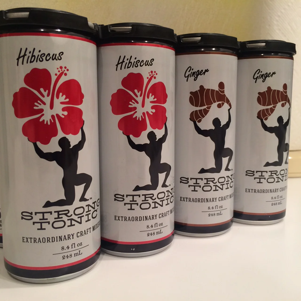
When Strong Tonic set out to refresh its packaging for its line of small-batch tonic syrups, the goal was to create a brand identity as bold and distinctive as the flavors themselves. The result: a striking series of labels featuring the Strongman—a vintage-inspired figure whose pose and props change with each flavor, symbolizing the unique character of every bottle or can.
From classic to exotic blends, each design tells its own story. The Strongman might hold a ginger root, a hibiscus flower, or nothing at all—visual cues that instantly communicate flavor while keeping the brand’s playful personality and handcrafted authenticity front and center.
The logo and packaging system combine craftsmanship, nostalgia, and modern appeal, balancing old-world strength with small-batch sophistication. Together, they create a cohesive, collectible line that stands out on the shelf and reinforces Strong Tonic’s reputation for quality, creativity, and flavor with punch.
Strong Tonic—handcrafted strength in every pour.